
Analytics reports
Analytics has the reports for questions the dashboard can’t answer at a glance: how this year compares with last, where your money went month by month, and how your net worth has grown. Open Analytics in the sidebar.
Find your way around
Section titled “Find your way around”The reports are listed on the left:
- Trends Comparison, Cash Flow, Net Worth History and Pivot
- The Investments reports (Net Worth Drivers, Contributions and Investment Projection) are for investment portfolios.
On a wide screen, Analytics opens on Trends Comparison. Click Collapse to shrink the list and give the report more room. On a narrow screen you see the list first; open a report, then click the back arrow (‹) next to the report’s title to return. Some controls fold away behind an Options or Filters button.
Every report follows the rules in How stats are calculated. Transfers between your own accounts (except loan payments), Out of Wallet transfers and balance adjustments are never income or expenses. Accounts with Exclude from statistics on are left out.
Trends Comparison
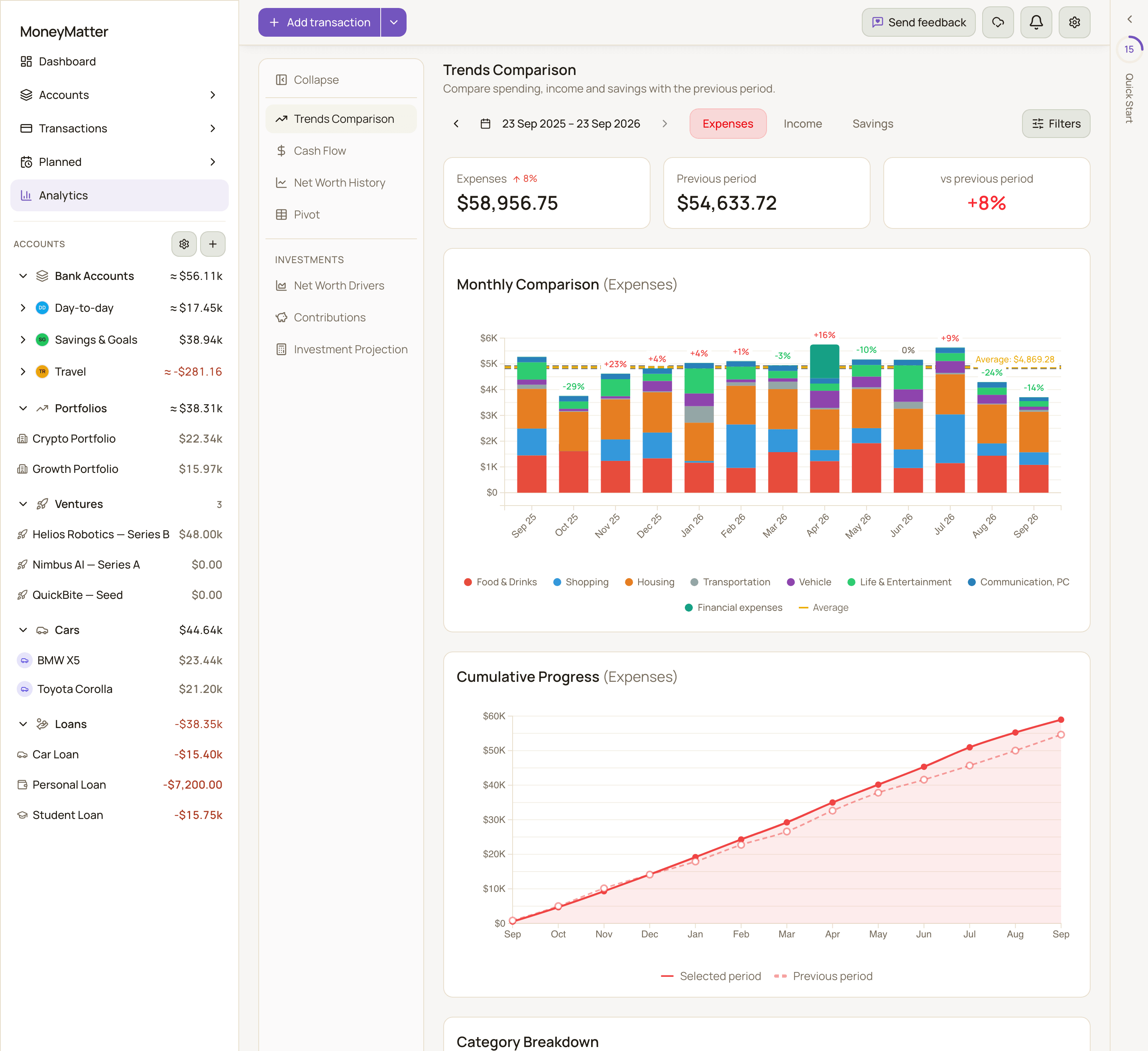
Section titled “Trends Comparison”Answers: Am I spending more, earning more or saving more than in the previous period?
Controls
Section titled “Controls”- Period: the last 12 months up to today by default.
- Metric: Expenses, Income or Savings. Savings is income minus expenses.
- Filters: narrow the report by Categories, Payees and Tags (each can Include or Exclude) and by Accounts. Reset clears them.
What you see
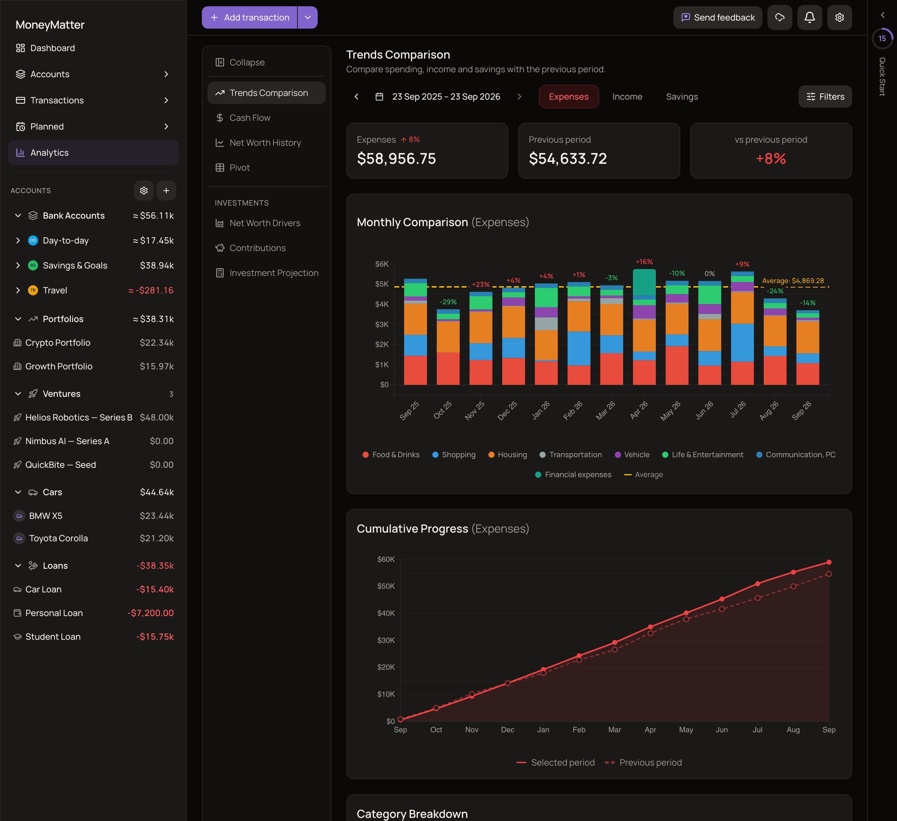
Section titled “What you see”- Summary cards: the total for your metric, the Previous period total, and the change vs previous period. The previous period is your period moved back by the number of calendar months it touches. For whole months (for example January to December) that is the period just before yours. The default range starts partway through a month, touches 13 months, and so is compared with the range 13 months earlier. For expenses, an increase shows in red.
- Monthly Comparison: a bar for each month, split by category, with the Average and Total. Click a category in the legend to hide it from the chart, which adds it to your filters. Click a bar (or a segment of a bar) to open the matching transactions. On a touch screen, tap the bar, then tap View transactions.
- Cumulative Progress: your running total through the period, drawn against the previous period’s. Months that haven’t happened yet are never shown.
- Category Breakdown: your top categories, with View all categories for the rest. It’s hidden when the metric is Savings.
Cash Flow
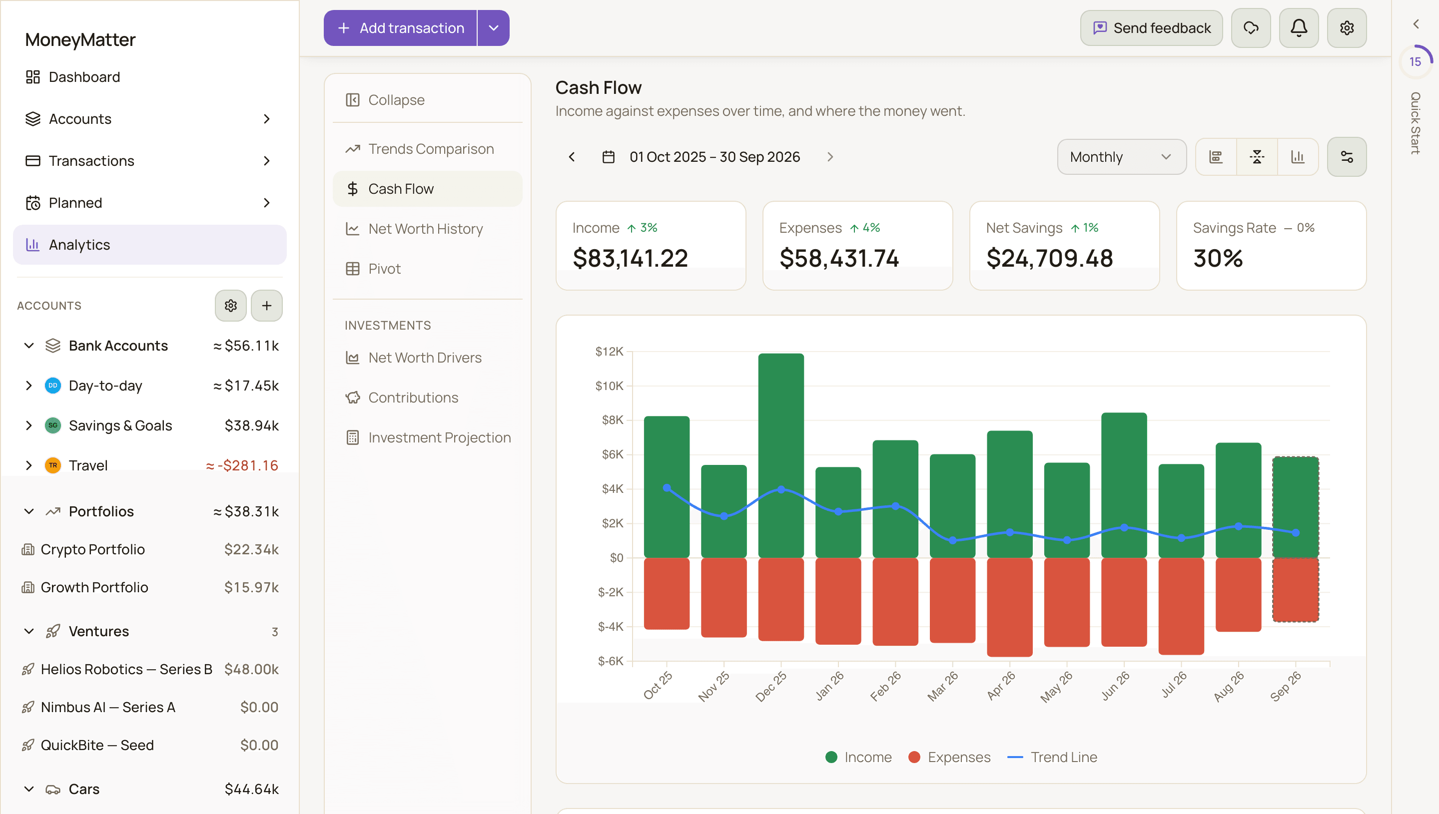
Section titled “Cash Flow”Answers: How much came in, how much went out, and how much did I keep?
Controls
Section titled “Controls”- Period: Last 3 months, Last 6 months, Last 12 months (the default), This year, Previous year or All time.
- Granularity: Monthly, Bi-weekly or Weekly. Weeks start on Monday.
- Chart type: Stacked, Mirrored (the default) or Grouped.
- Settings (the sliders icon): Show trend line adds a smoothed average of your net cash flow.
What you see
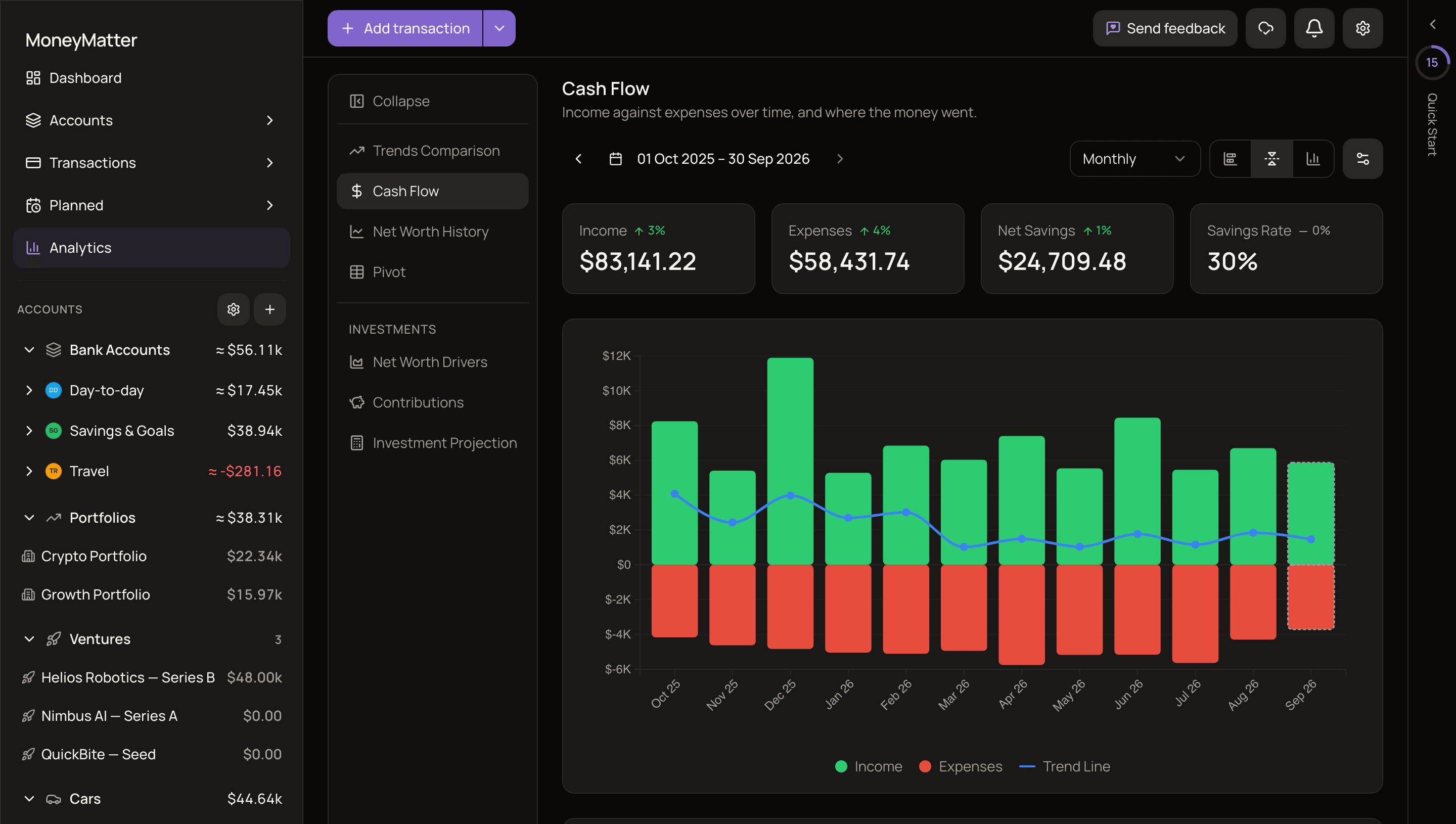
Section titled “What you see”- Income, Expenses, Net Savings and Savings Rate for the whole period. Each card shows the change against the same length of time just before.
- Savings Rate is net savings divided by income. It’s 0% when there’s no income in the period.
- A chart of income against expenses for each month, fortnight or week.
Where the money went
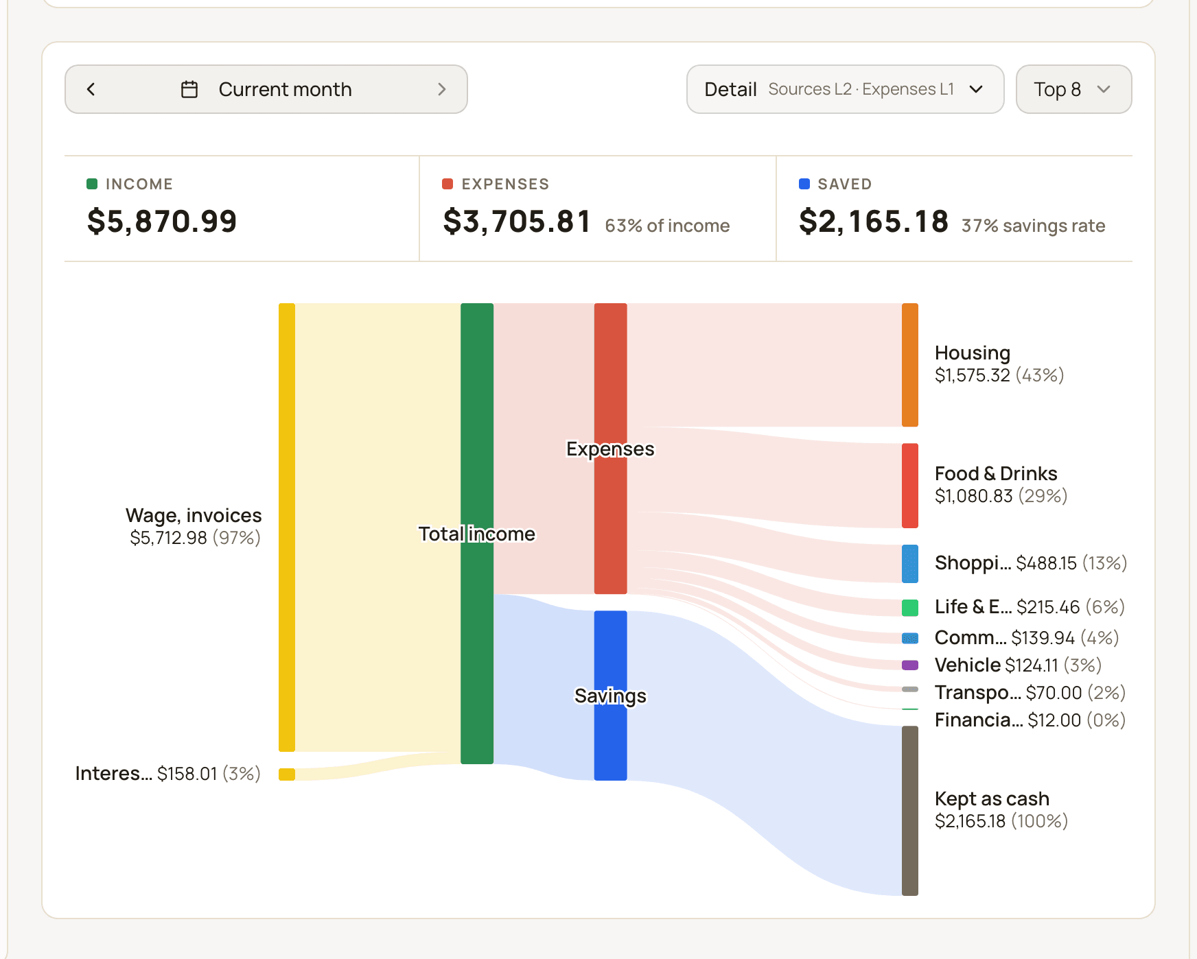
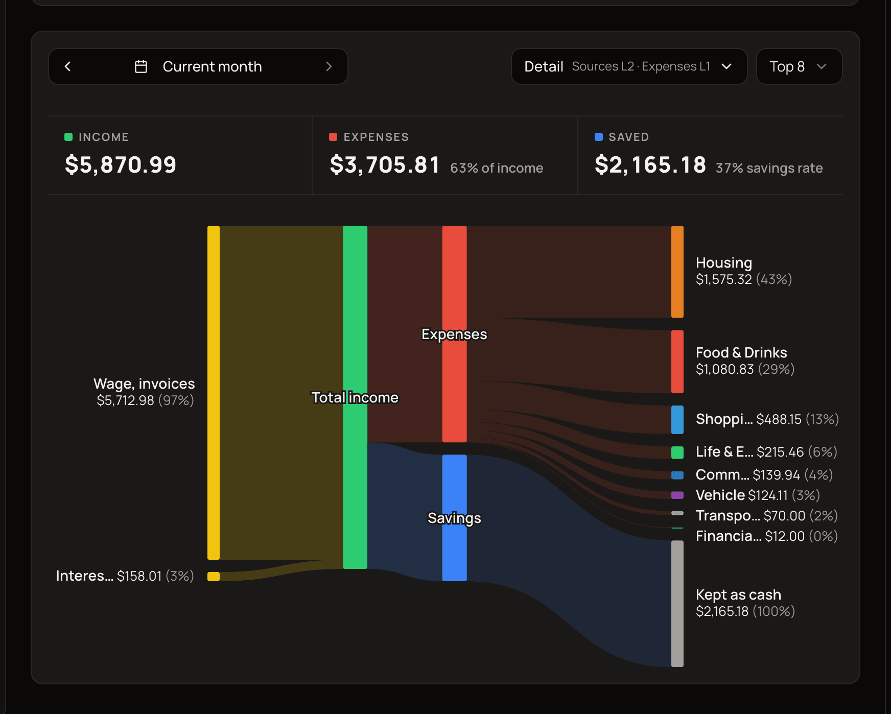
Section titled “Where the money went”Below the chart, a flow diagram shows where income came from and where it went, for one period at a time. It starts on the current month. Click a bar in the chart above to switch to that period.
- Detail (the button shows, for example, “Sources L2 · Expenses L1”) sets how deep each side goes. Pick a level for Sources (income) and for Expenses: Level 1 shows top-level categories, and higher levels break them into subcategories.
- The Top control (for example Top 8) sets how many categories each side shows. Smaller ones are grouped into Other.
- When the section is narrow, for example on a phone, Detail and Top move into the sliders icon button (Chart settings) next to the period.
- Money moved into categories you count as savings (see General settings), or into investment portfolios, shows as its own savings destination, not as an expense. Whatever is left of what you saved shows as Kept as cash.
- A Deficit appears when your expenses plus the money moved into those savings destinations are more than your income. Its note says where the gap was covered from, for example “Expenses exceeded income by 200 EUR. The gap was covered from existing account balances.”
The diagram counts a refund against the original purchase’s category and period, and leaves out uncategorized transactions, so its totals can differ slightly from the chart above.
Net Worth History
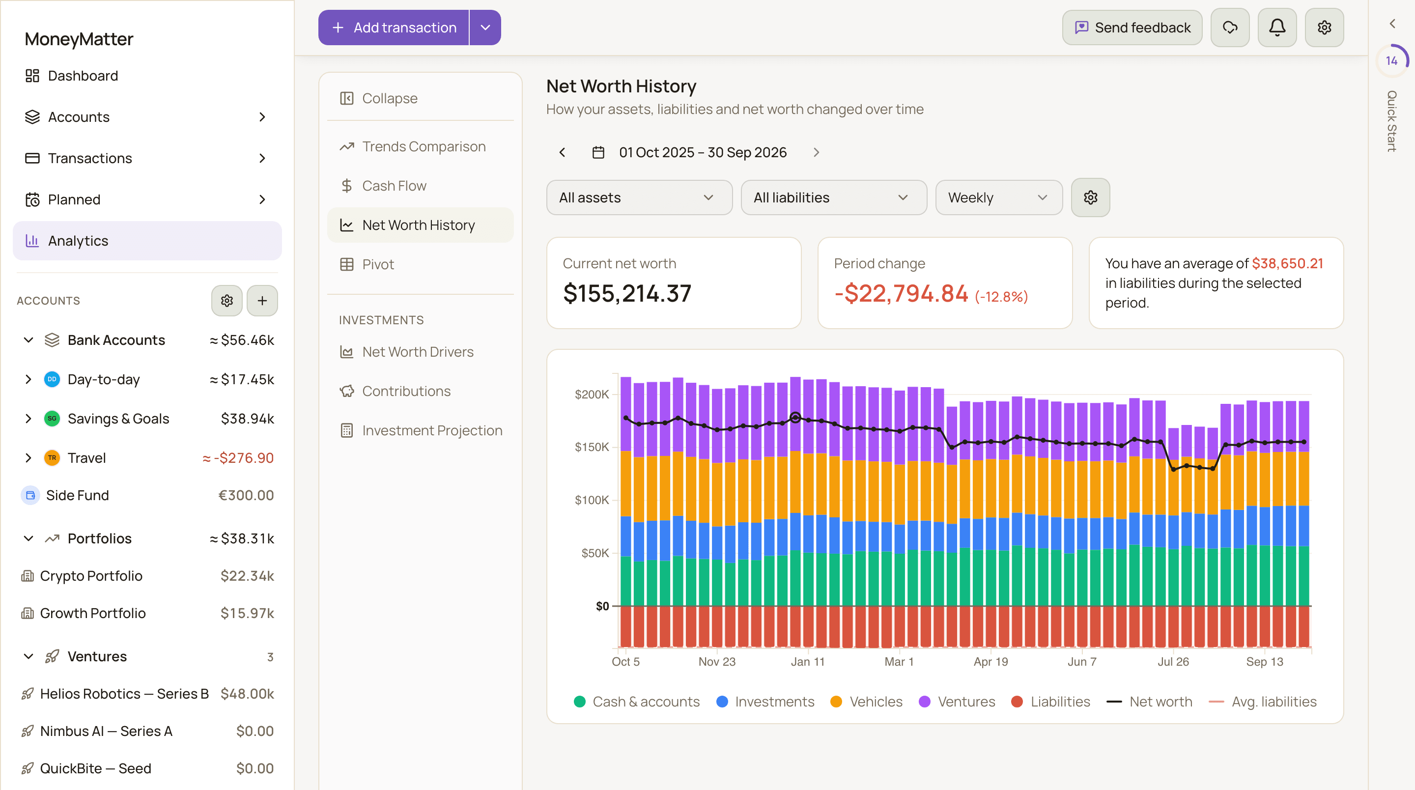
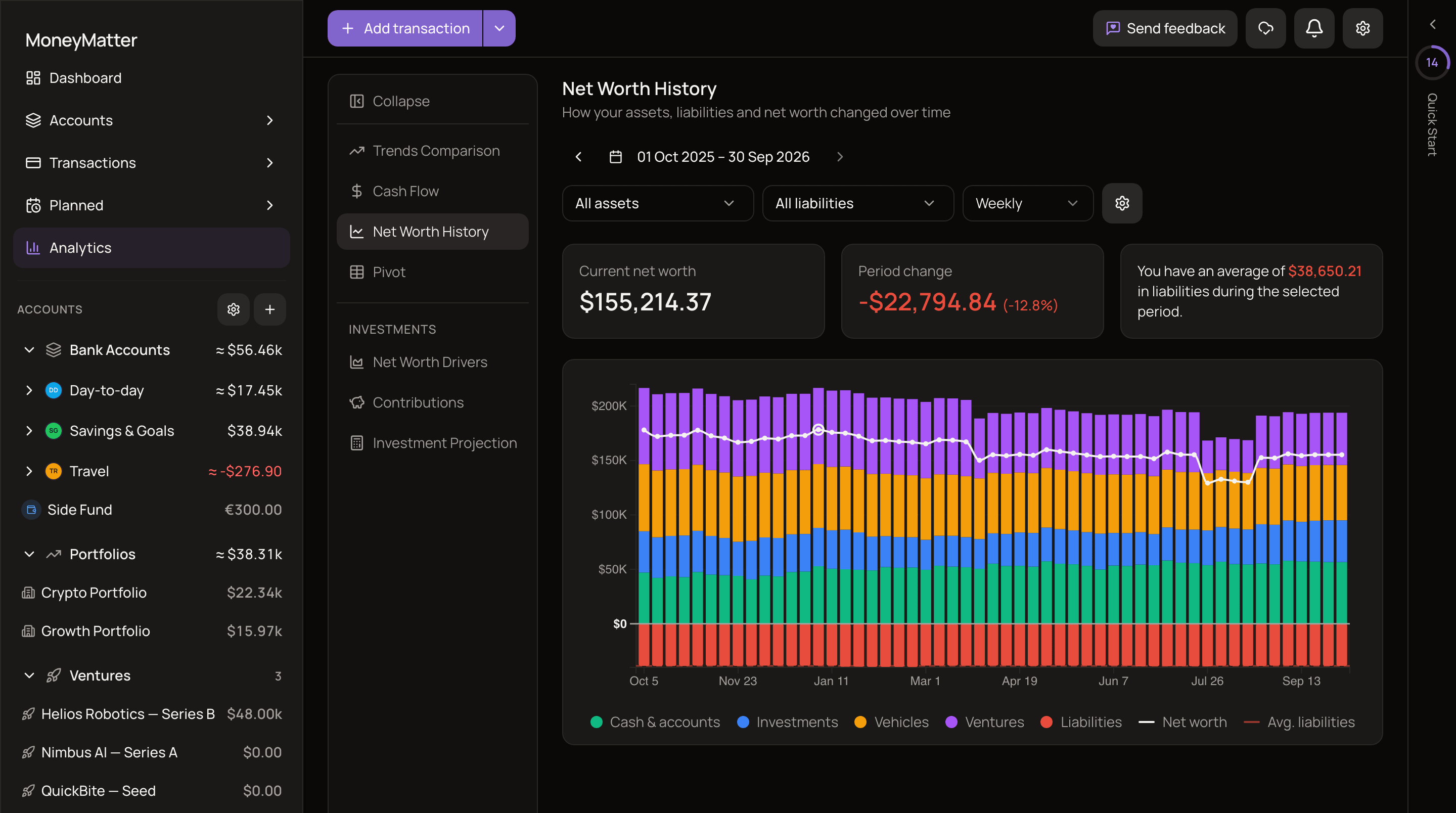
Section titled “Net Worth History”Answers: How have my assets, debts and net worth changed over time?
Controls
Section titled “Controls”- Period: the last 12 months by default.
- Asset types: All assets, or pick from Cash & accounts, Investments, Vehicles and Ventures.
- Liability types: All liabilities, or pick from Credit card, Loan and Overdraft.
- Granularity: Weekly, Monthly, Quarterly or Yearly. MoneyMatter picks one to suit the period’s length. If you choose one yourself, it’s remembered in this browser. Options that would draw too many points for the period are disabled.
- Chart settings: Zoom liabilities scale enlarges small debts so they stay visible next to large assets.
What you see
Section titled “What you see”- Current net worth: your net worth at the last point on the chart.
- Period change: the difference between the first and last points, with the percentage. When the first and last points on the chart are at least a year apart and your net worth is positive at both, you’ll also see a yearly rate, such as ”≈ 8% / yr”. A 12-month period is just short of that, so choose a longer range (for example All time) to see it.
- A line about your liabilities, such as “You have an average of 1,200 EUR in liabilities during the selected period.”
Each point is your balance at the end of its week, month, quarter or year. The last point is at the end of your period.
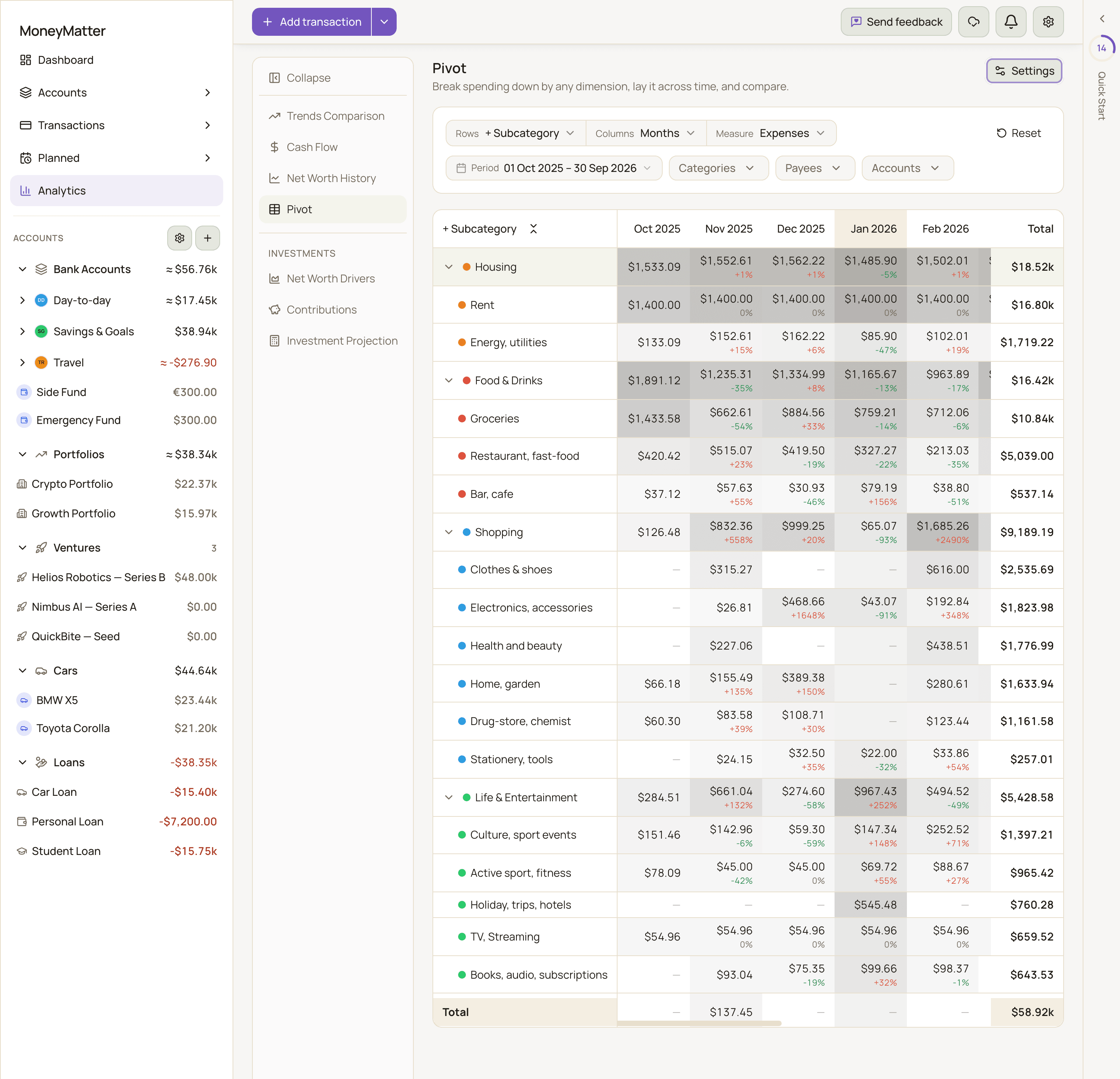
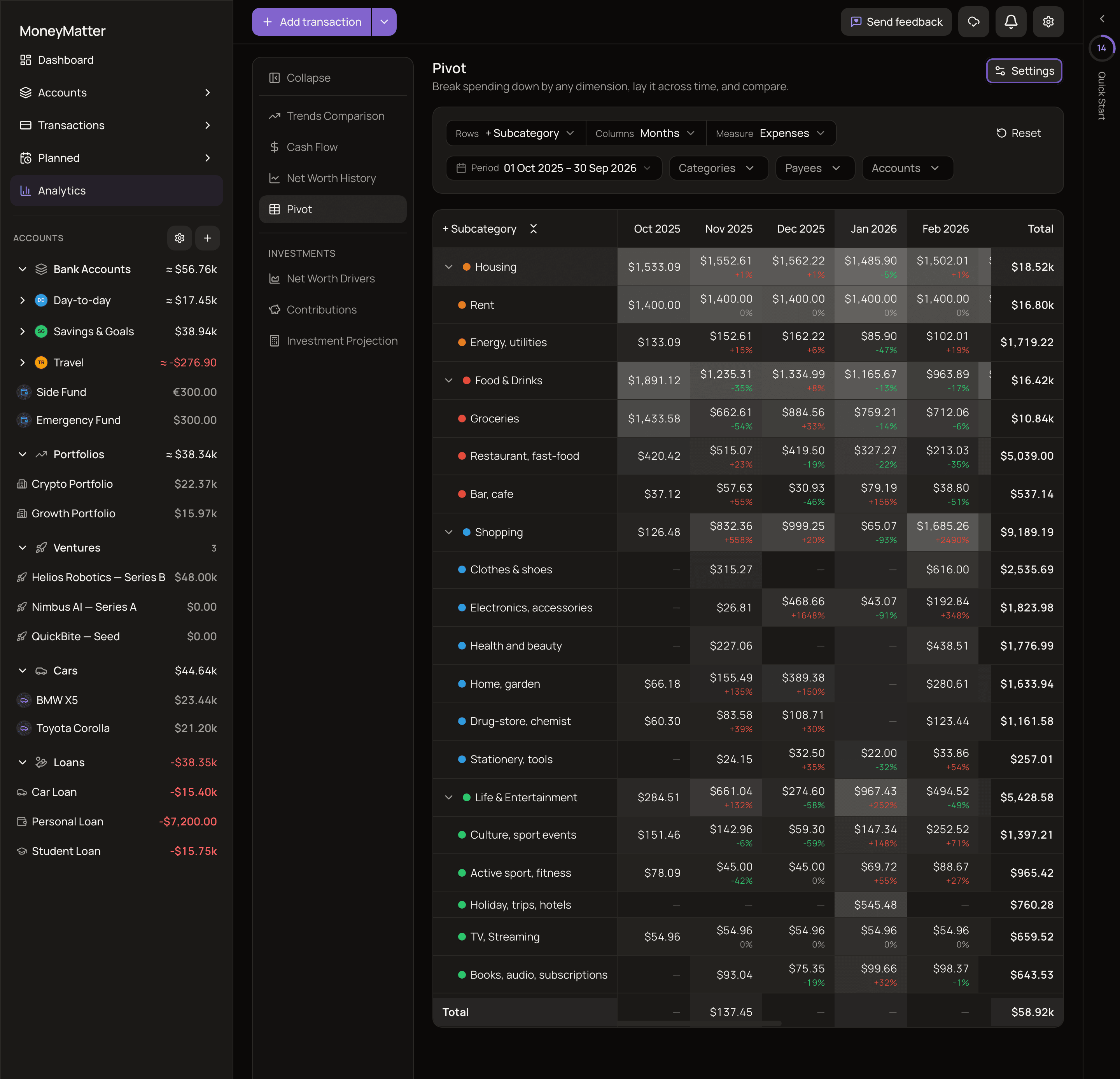
Answers: How did spending on each category, payee or tag change from one month (or week, quarter, year) to the next?
Controls
Section titled “Controls”- Rows: Category, + Subcategory, Payee or Tag.
- Columns: Years, Quarters, Months or Weeks.
- Measure: Expenses or Income.
- Filters: the Period (Last 6 months, Last 12 months, This year, Previous year, Last 3 years, Last 5 years or All time), plus Categories, Payees and Accounts. Reset goes back to the defaults.
- Settings (the sliders icon at the top right of the report): under Views, Save current view stores your layout and filters under a View name, and you can pick a saved view from the list. Under Display options, turn Heatmap and % change on or off. % change is on by default.
A view remembers the exact dates of its period. Opening it later shows those same dates, not the latest months.
In the table, use Expand all and Collapse all to open or close subcategories.